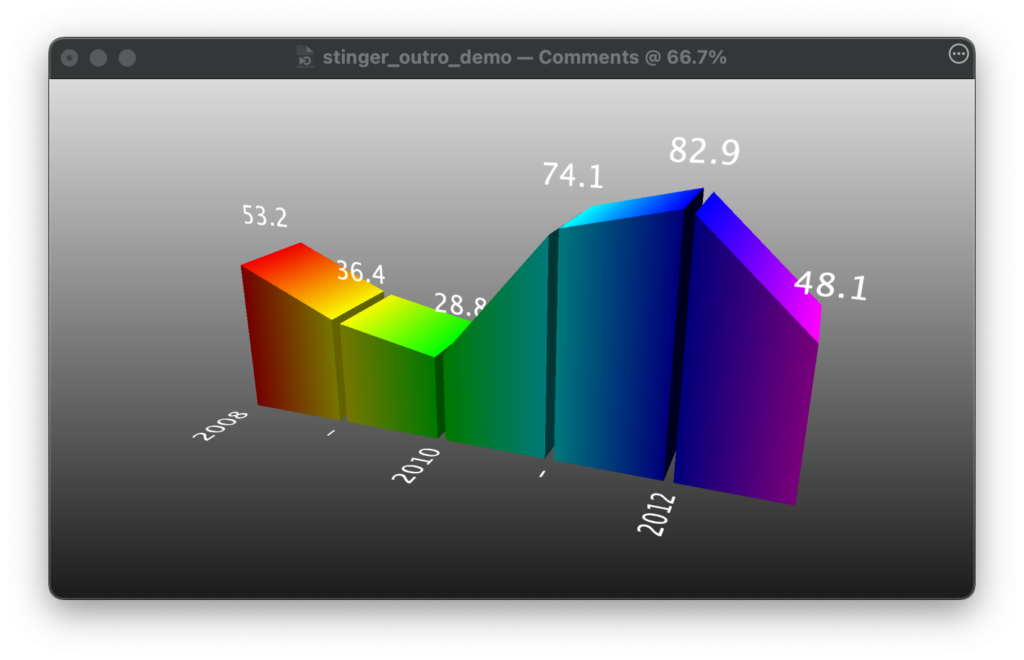
The Graph 3D layer in mimoLive allows you to present data visually in three-dimensional space. This layer supports different graph types and customizable appearance options to suit various presentation needs.

Layer Variants
Layer variants allow you to create different settings for the same layer, such as unique data, colors, or animations. There’s no limit to the number of variants you can create, providing flexibility for live productions. Read more about layer variants here.
User Interface Variants
- In the layer stack all existing variants are listed. You can expand or collapse this list by clicking the up/down chevron next to the layer name.
- In the layer stack, all existing layer variants are listed, with an indicator showing if the variant is currently live.
- Left/right arrows below the preview window let you navigate through different variants.
- In the center, the name of the currently selected variant is displayed.
- The plus (+) and minus (-) buttons on the right allow you to add or delete variants.
Event: You can link the layer’s activation to a specific event, which will automate the process of showing sponsor logos based on certain triggers during your broadcast.
Triggers
Toogle Shortcut
You can assign keystrokes and events to toggle layers and layer variants. This let you control the appearance of the layer and / or the variants.
If a keystroke is assigned to a variant, the key will appear as a small gray indicator next to the Live button in the list of variants. This setup makes it easy to manage and switch between different versions of a layer during live broadcasts.
Events
You can also control a layer or variant by events. By the dropdown menu you can assign one of the following events:
- None
- Live on Show Start
When you press the Start Show button the layer switches to LIVE. - Live on End Trigger
The layer switches to LIVE when the Stop Show button is pressed. - Off on End Trigger
The layer switches to OFF when the Stop Show button is pressed.
Content Settings
- Values: Data points that define your graph. Example values: 36.4, 28.8, 74.1, etc.
- Labels: Text labels for categories or time periods (e.g., 2008, 2010).
- Color Scheme: Customizable. You can use a predefined color table or specify individual colors for each data point.
Appearance
- Graph Type: Set to “Mountain” in this case, but can be changed to “Bars” for a bar graph.
- Text: Customize font and size for labels and values. Example: LucidaGrande, size 37.
Geometry Settings
- Width, Height, Depth: Adjust the dimensions of the graph.
- Gap: Adjust the space between data points (set as a percentage).
- Position X, Y: Controls the positioning of the graph.
- Rotation X, Y, Z: Allows rotation of the graph in 3D space. Example: Rotation Y is set to -21.12, and Rotation X to 20.56.
Animations
- Incoming & Outgoing: Define how the graph animates when entering or exiting the screen.
- Duration: Set the animation length (e.g., 2 seconds).
- Background Duration: Set the animation length, default 0.5 s.
Background
- Background Type: Choose a background type for the graph (e.g., gradient). Example: Gradient from Top to Bottom (Gradient T to B).
